Branded careers site
A careers website that turns visitors into candidates
From first impression to first day, your careers site shapes how candidates see your organization. We build it for you, fully branded and ready to convert in weeks.
From first impression to first day, your careers site shapes how candidates see your organization. We build it for you, fully branded and ready to convert in weeks.
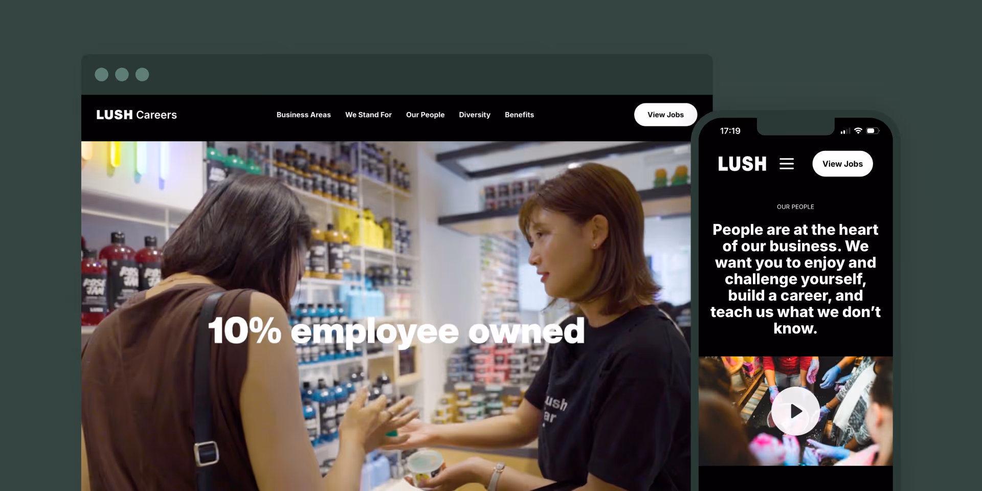
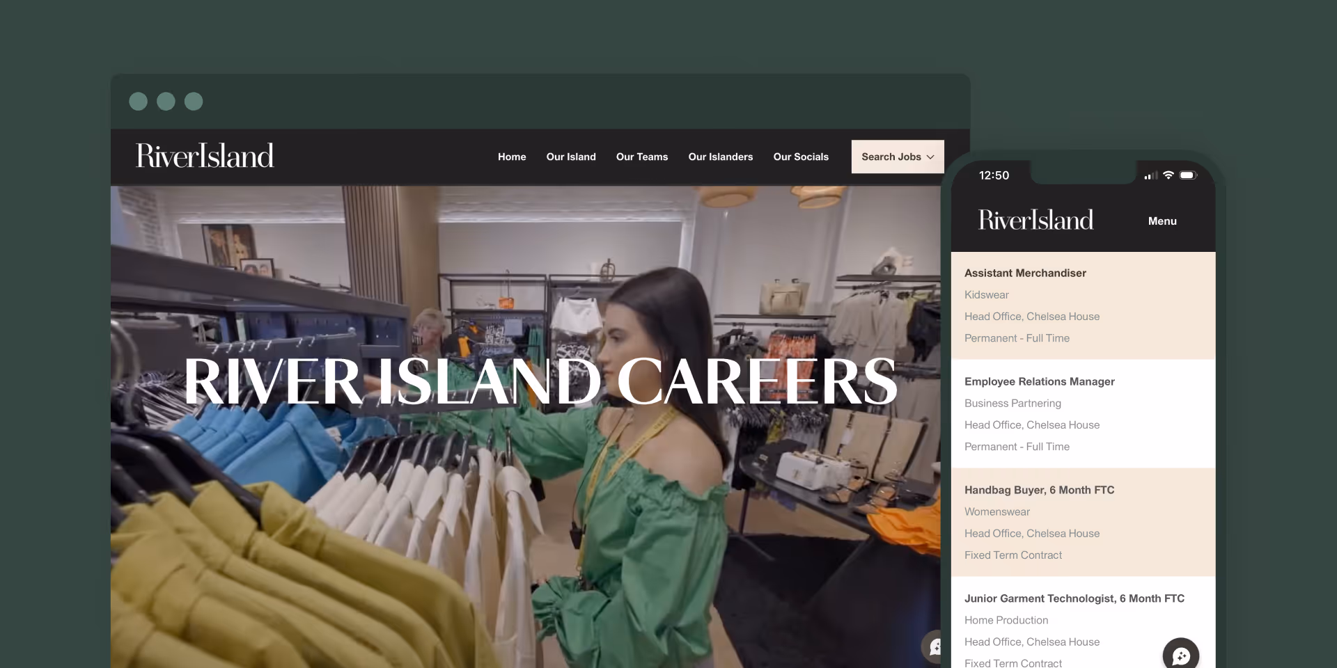
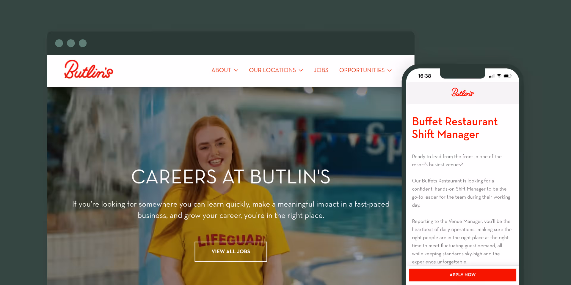
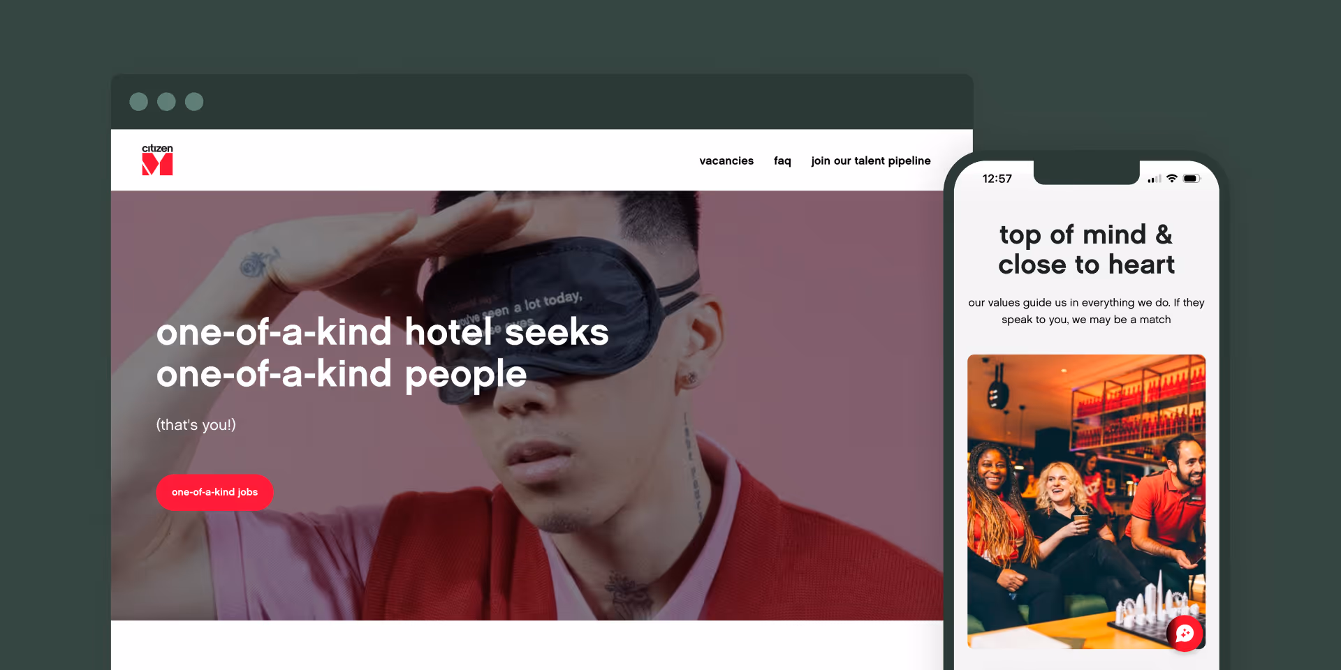
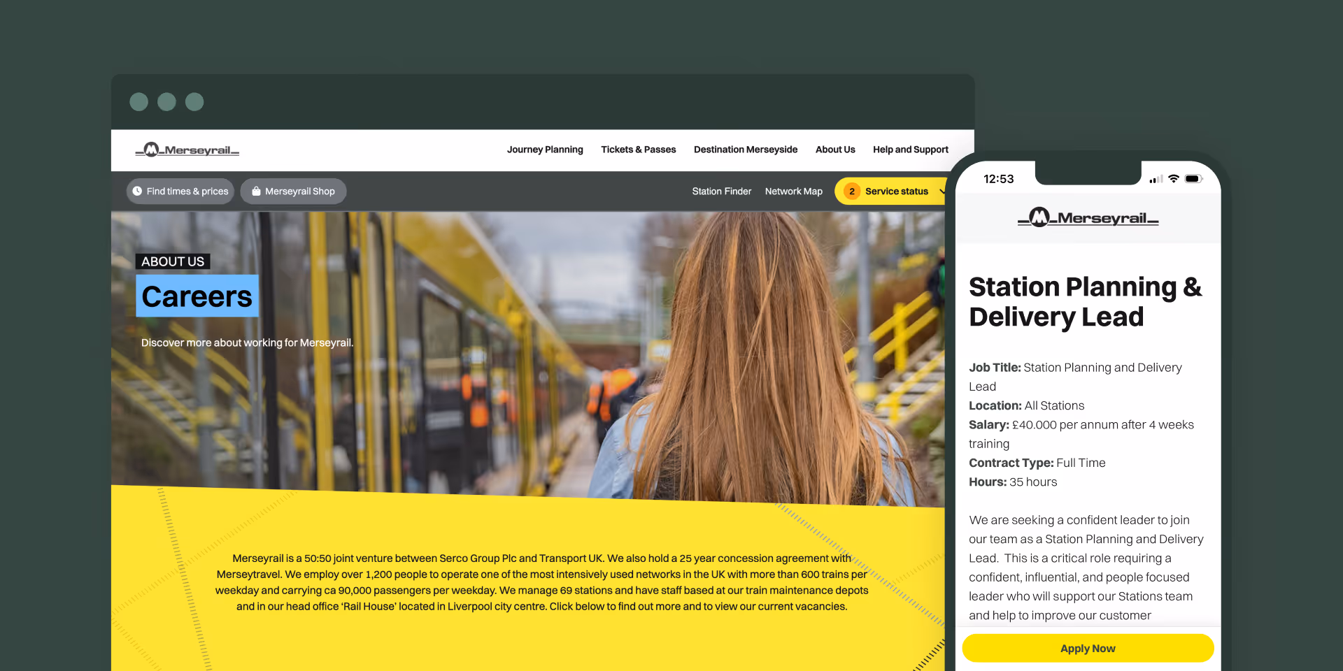
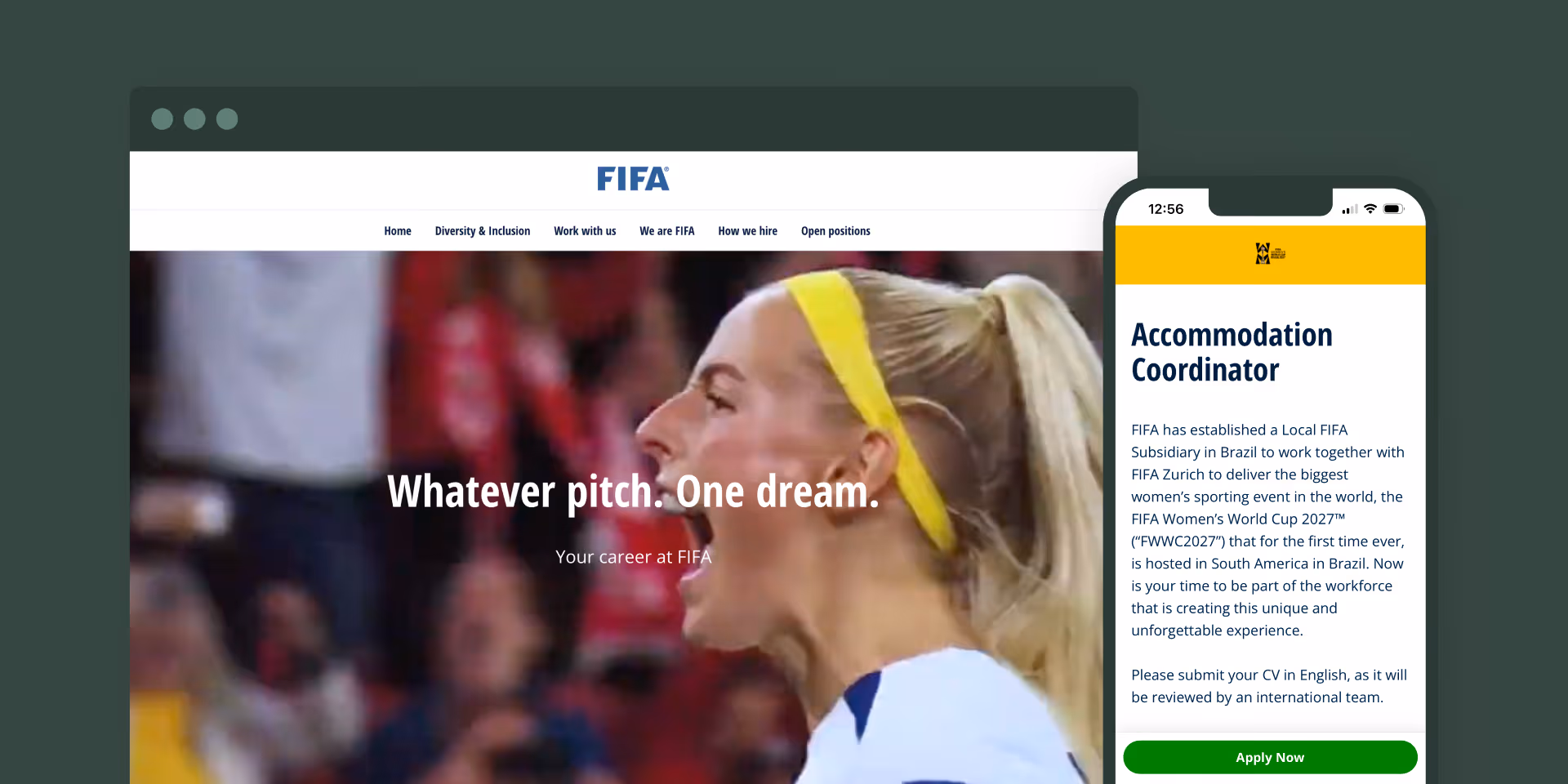
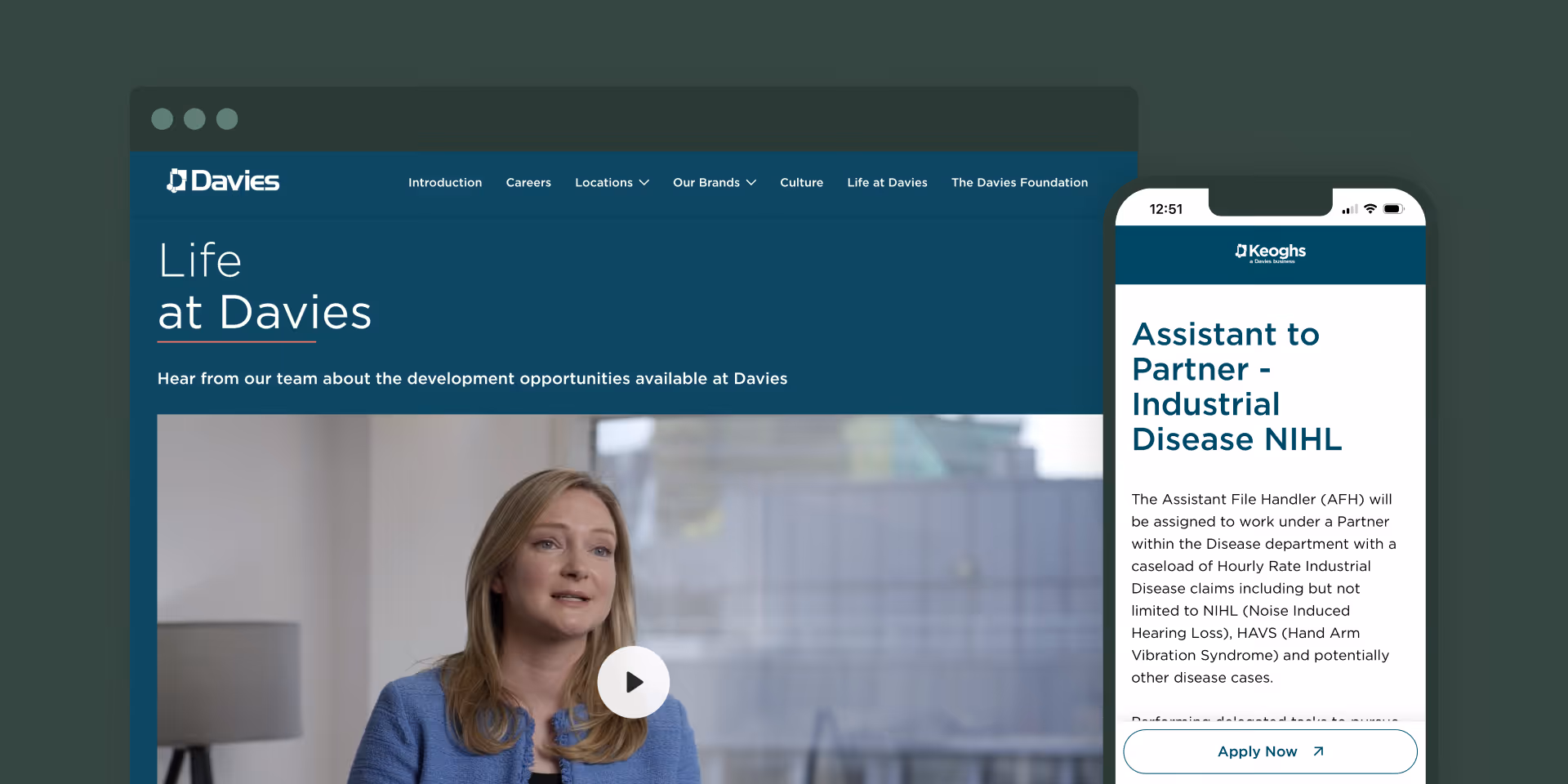
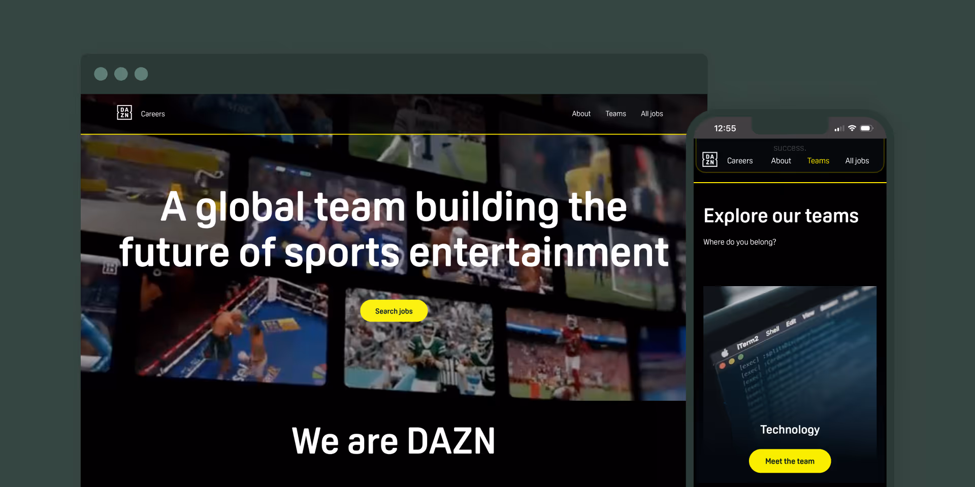
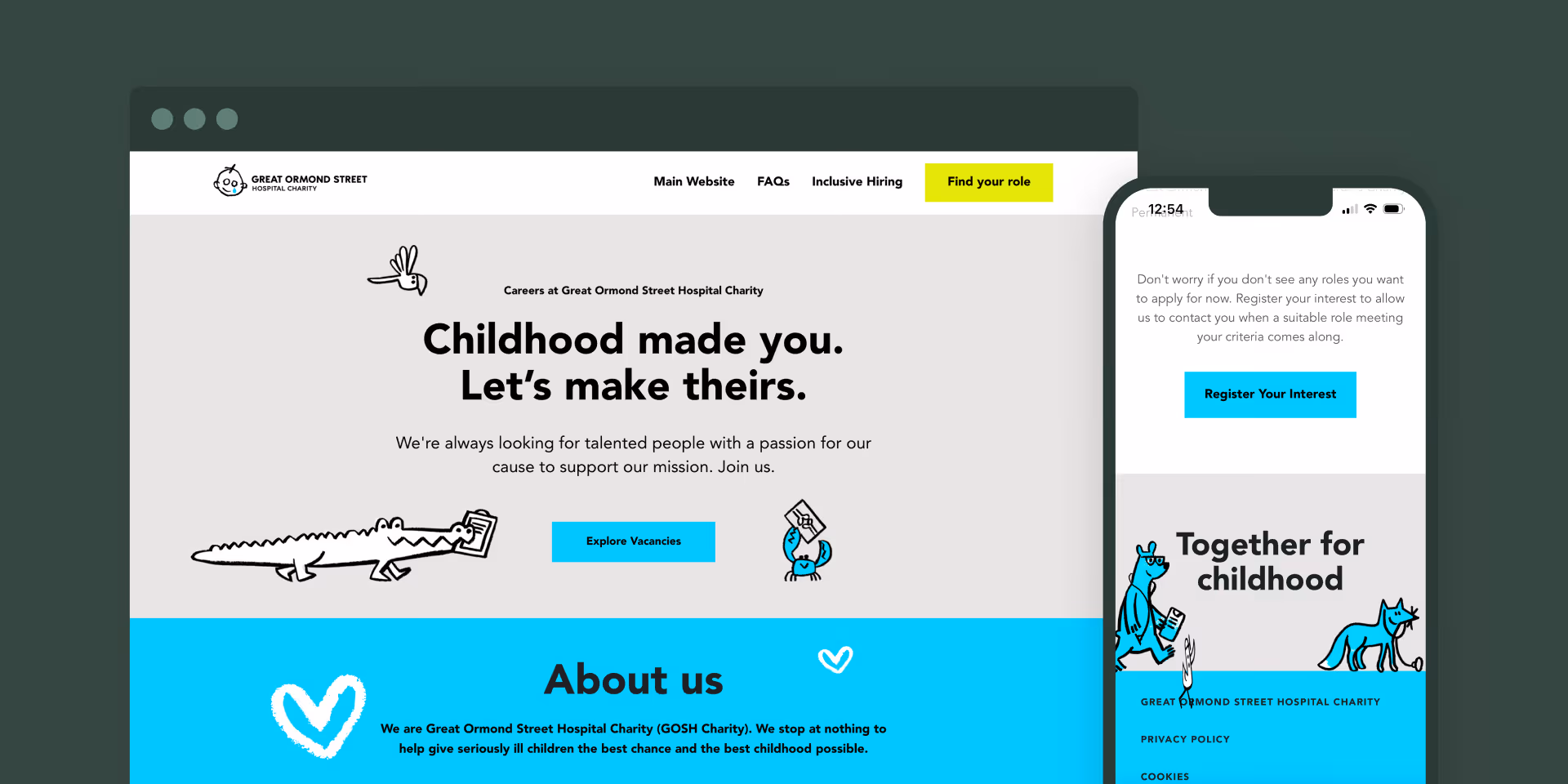
Most careers sites look like they were built in an afternoon. Yours shouldn’t. Pinpoint creates a site that matches your brand, from colors and fonts to imagery and layout, so candidates land on a site that reflects who you are as a company, and as an employer.
Small details make a big difference. Fast load times, intuitive search, clear application flows, and information candidates really care about all help to reduce drop-off and keep things moving.

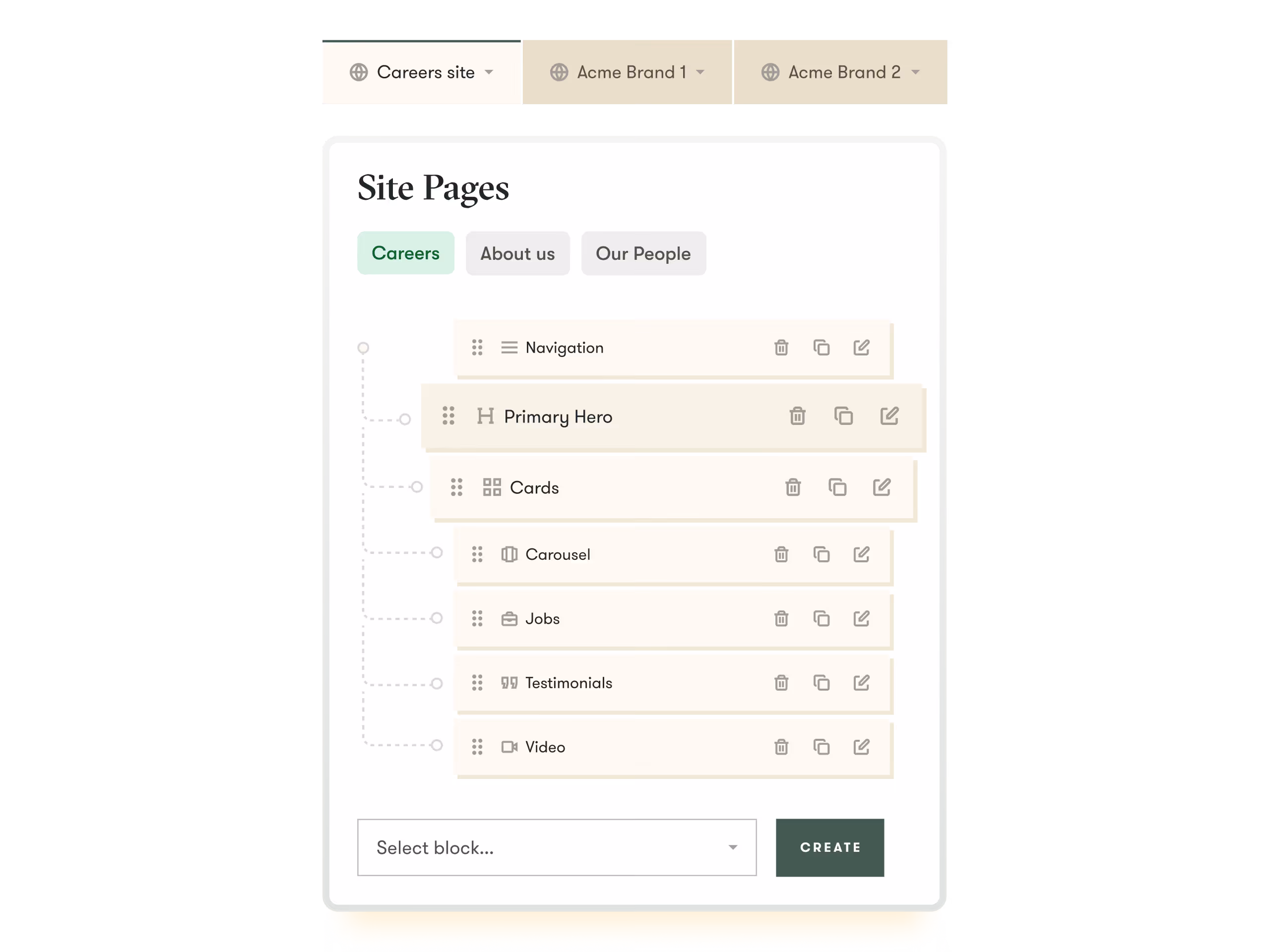
If you operate multiple employer brands, each can have its own fully branded site, all managed from one Pinpoint account. Separate domains, job feeds, and candidate experiences, with one clean workflow behind the scenes.
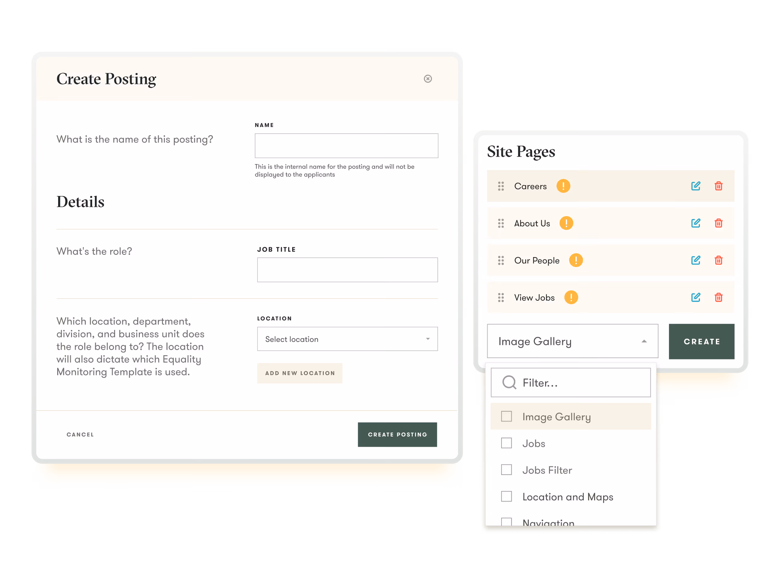
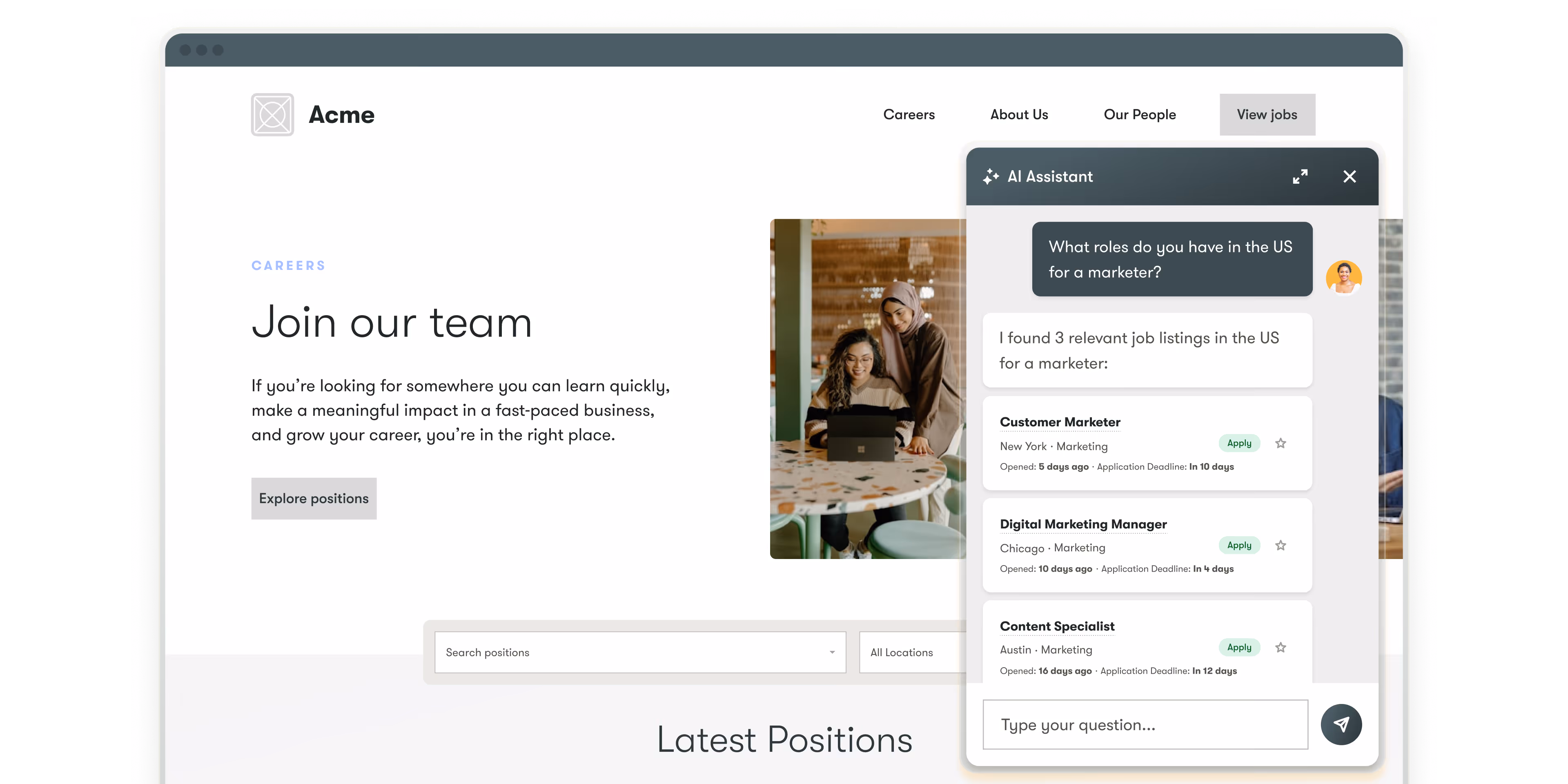
Publish roles instantly and update your careers site whenever you need. Edit content, make changes, and keep everything up to date without submitting tickets or waiting on your marketing team.


reduction in time to hire
casting day coordination
candidate communication

candidate engagement
candidate trust
reliance on paid ads

risk of candidates stalling
visibility for TA leaders and stakeholders
employees supported in the states

visibility on all candidates
locations supported
hiring manager adoption
Yes. The branded careers website is included in your Pinpoint subscription, with no extra build fee or hosting cost. The design, build, and launch are all part of the package.
Yes. Once your site is live, you have access to a drag-and-drop editor to manage content, update copy, and add new pages yourself. Job listings update automatically as you post and close roles in Pinpoint, so you won't need to manually update your jobs page. For bigger structural changes, our team is here to help.
If your organization operates more than one brand, each can have its own fully branded careers website, all of which are managed from your single Pinpoint account. Each brand can have its own visual identity and job feed, so candidates get a tailored experience for the brand they're applying to. This works well for holding companies, multi-national organizations, and businesses that hire under different names.
Yes. Pinpoint offers flexible deployment options to suit your website's setup. You can use a full standalone careers site, embed a jobs widget on your existing site, use a hosted jobs page on a subdomain, or connect via API if your development team prefers a custom integration. Your Pinpoint implementation team will help you choose the right approach for your setup.
Yes. Pinpoint offers flexible deployment options to suit your website's setup. You can use a full standalone careers site, embed a jobs widget on your existing site, use a hosted jobs page on a subdomain, or connect via API if your development team prefers a custom integration. Your Pinpoint implementation team will help you choose the right approach for your setup.